
Taking a NorthWest masterplan to market, village by village
01 — The brief
Built for staged releases
Rua Hills had to sell a lifestyle long before the first section settled. The Hugh Green Group needed the story of the land, the four village masterplan and the Stage 1 release to land in a single scroll, with an obvious path to registering interest for buyers and their agents.
A full width video hero, the masterplan told village by village, staged section availability, news updates the sales team control, and a register interest flow that lands straight in their inbox.
The brand did not exist either. Rua Hills needed a name, a mark and a set of rules that would hold from a hoarding on Fred Taylor Drive to a phone screen on a Sunday afternoon.
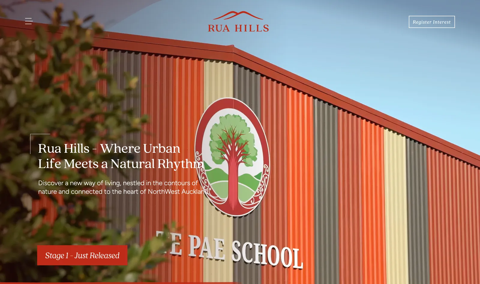
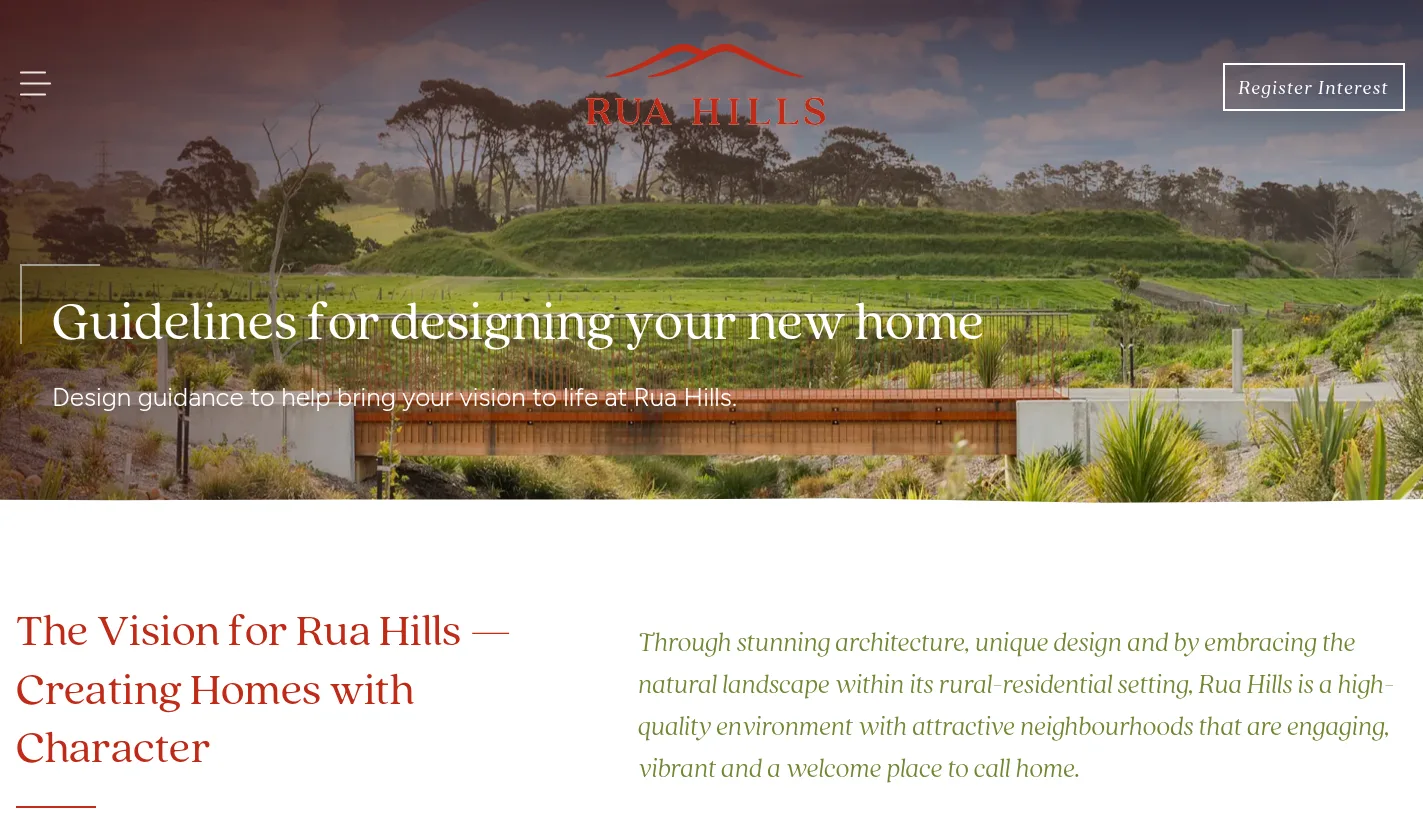
The masterplan, told village by village A full width video hero opens onto the land itself, then the four village 'ribbon' is explained in the order a buyer asks about it: where it is, what is being built, what is for sale now.
By the numbers
A masterplan, made shoppable
Feature
Section buyers shortlist on a phone and confirm at a desk, usually with a partner and an agent in the loop. The lot map, the price list and the register interest form all had to work one-handed, and the sales team had to be able to change any of it in minutes.
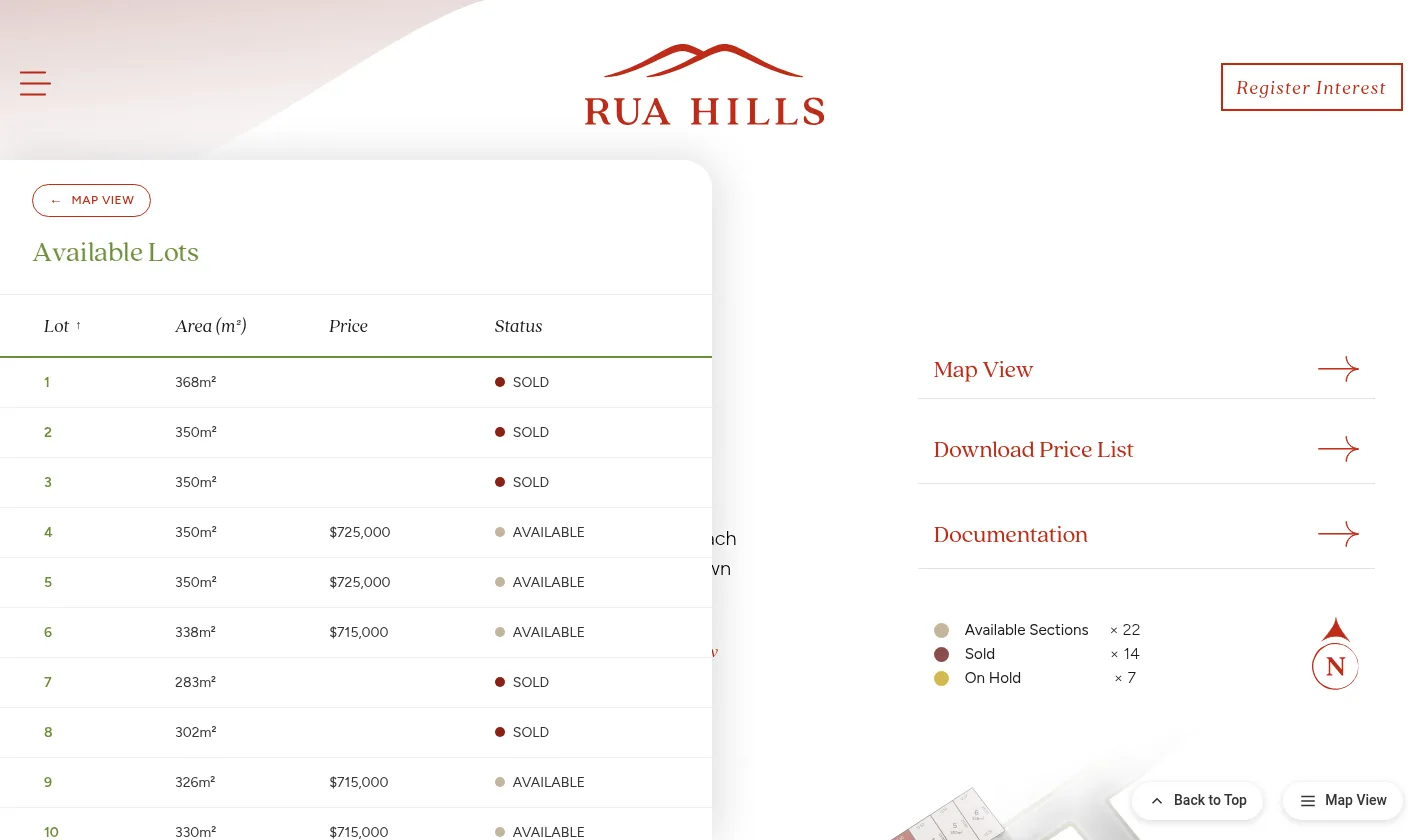
- Interactive lot map with a list view fallback
- Available, On hold and Sold statuses updated in the CMS
- Price list and design guideline downloads
- Register interest straight to the sales inbox
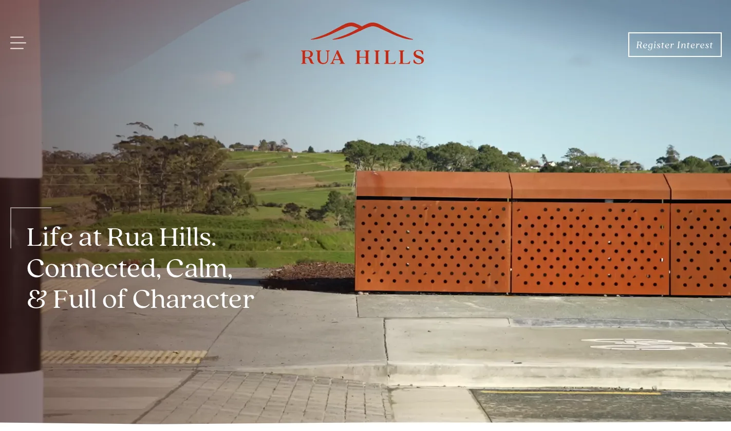
Brand identity

Designing the Rua Hills brand
We designed the Rua Hills logo and brand identity around the idea of connected country living. The mark combines a warm, timeless serif wordmark with sweeping hill forms that reference the rolling NorthWest landscape and the four-village masterplan.
The Rustic Red colourway became the brand's signature, chosen to feel grounded, premium and recognisable across signage, sales suites, print collateral and digital channels.
We also produced a comprehensive Brand Guidelines document that defines logo usage, colour palettes, typography, clearspace and minimum sizes, plus rules for applying the brand consistently across every touchpoint — from hoardings and brochures to the website and email campaigns.
02 — The process
How we got there
- 01
Brand before build
Logo, palette, typography and a full set of brand guidelines came first, so the website, the hoardings and the sales collateral all launched speaking the same language.
- 02
Structuring a staged masterplan
Four villages, released over years. We built the content model around stages rather than pages, so a new release is an entry the client adds, not a rebuild.
- 03
Making availability live
The Stage 1a lot map, the list view and the downloadable price list all read from one source, so an on-hold section is one change in the CMS rather than three.
- 04
Build on Oncord
News, availability, downloads and the register interest flow were built as CMS-managed content, with enquiries landing directly in the sales inbox.
- 05
Launch and handover
The site went live ahead of the Stage 1 release and the sales team was trained to publish updates, statuses and pricing themselves.
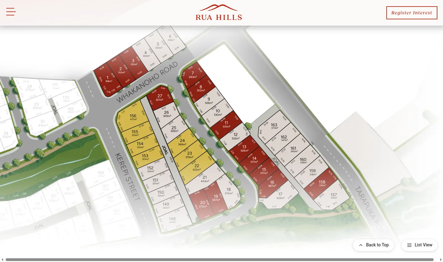
Every section, mapped and priced Stage 1a is browsable as an interactive map or a sortable list, with area, price and status on every lot and a price list download for buyers who want it on paper.
03 — The outcome
Handed over to the sales team
A brand and a website that launched together, ahead of the first section release.
Built on Oncord so the sales team can release new stages, update availability and publish news without a developer. Designed mobile first, because most enquiries arrive from a phone on a Sunday afternoon.
The same system carries the next villages: a new stage is a release the client publishes, not a project they have to commission.
Ready for a website like this?
Let's build the next one together
Design, build, content and search, handled by one Auckland team.