
The centre visit, before the visit
01 — The brief
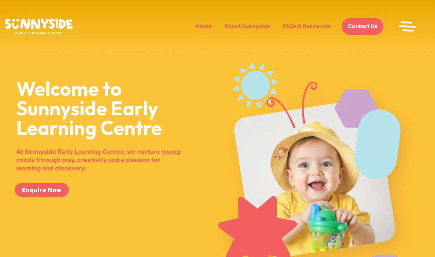
Warmth you can feel in five seconds
Sunnyside sits on Heretaunga Street West in Hastings, in the middle of Hawke's Bay. Parents shortlisting a centre look at three or four websites in an evening, and most of them look the same.
The brief was a site that felt like the room: bright, calm and clearly run by people who like children. Not stock photography and a phone number, and not so busy that a tired parent gives up before finding the fees.
Underneath the warmth it had to do a job. Answer the practical questions honestly, show the faces of the people who will hold the child, and make the enquiry the easiest thing on the page.
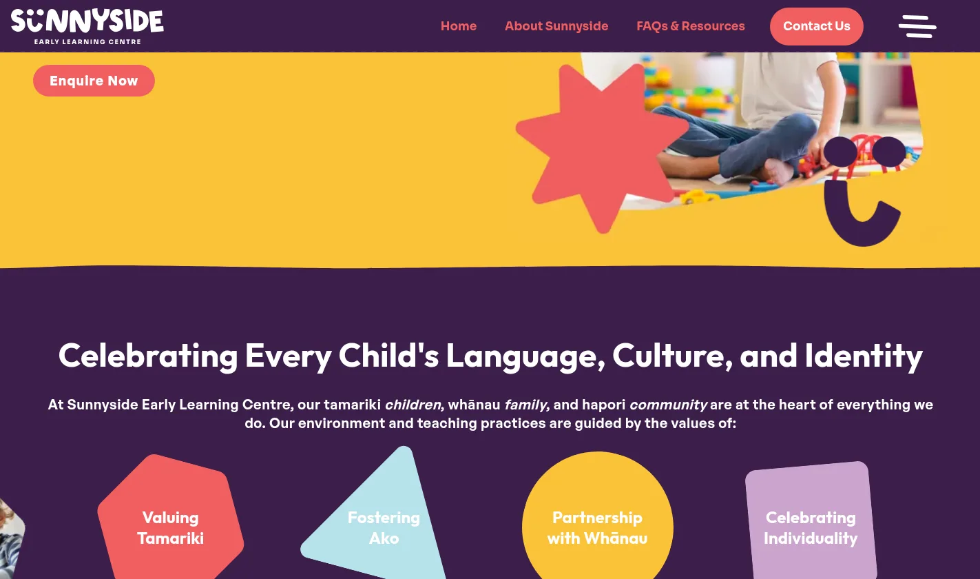
Bicultural by design, not by badge Te reo sits in the copy with a plain English gloss beside it, so the centre's commitment to Te Tiriti reads as practice rather than decoration, and no parent is left guessing what a word means.
By the numbers
Small site, every part earning its place
Feature
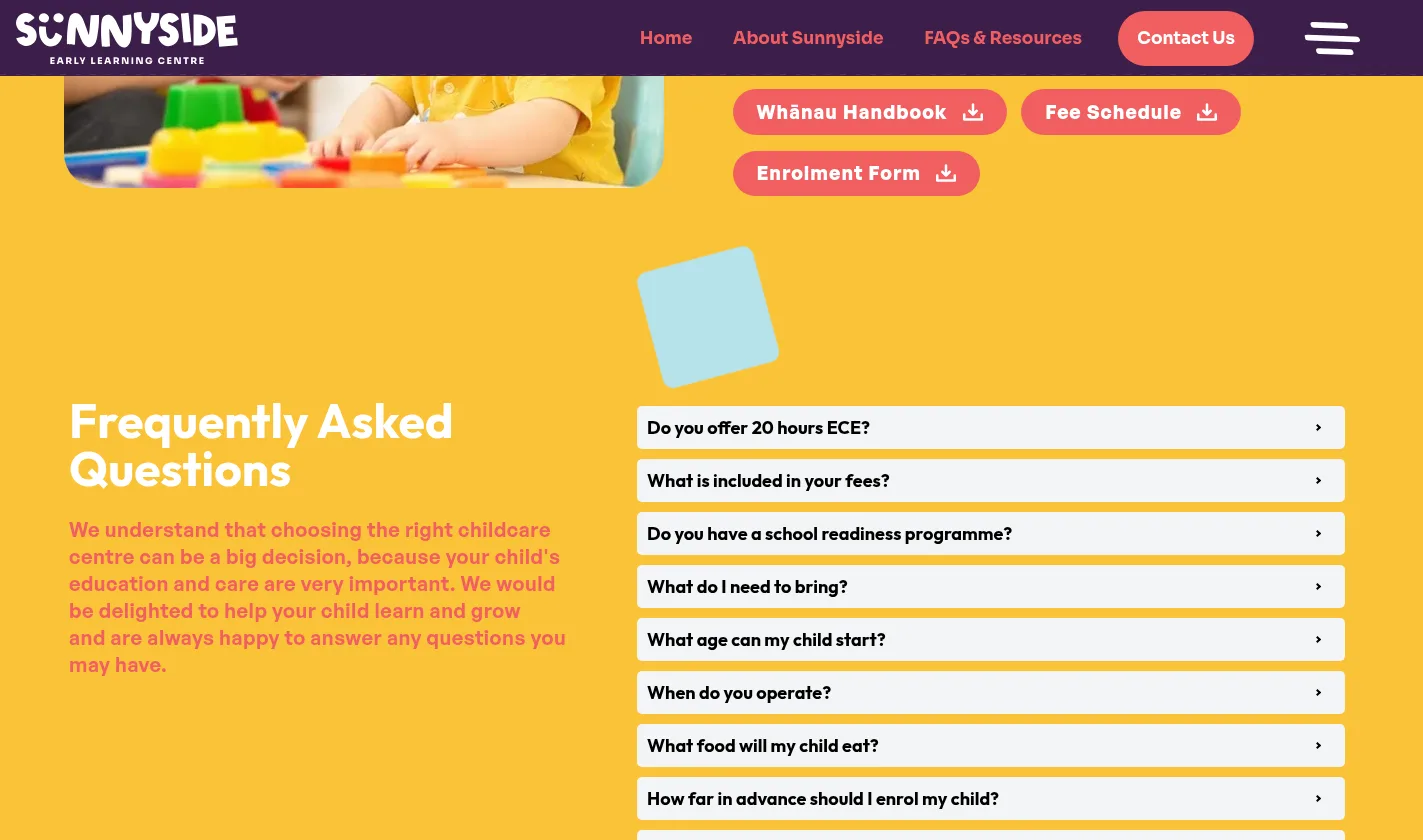
Most centre websites make a parent hunt for the two things they came for: what it costs, and how to book a look around. Here both are never more than a scroll away, on a phone, one-handed, usually after bedtime.
- Enquire buttons repeated down every page, not just in the header
- Fee schedule, whānau handbook and enrolment form as direct downloads
- An enquiry form on the pages where the decision is actually made
- Phone and email in reach at all times for the parents who would rather ring
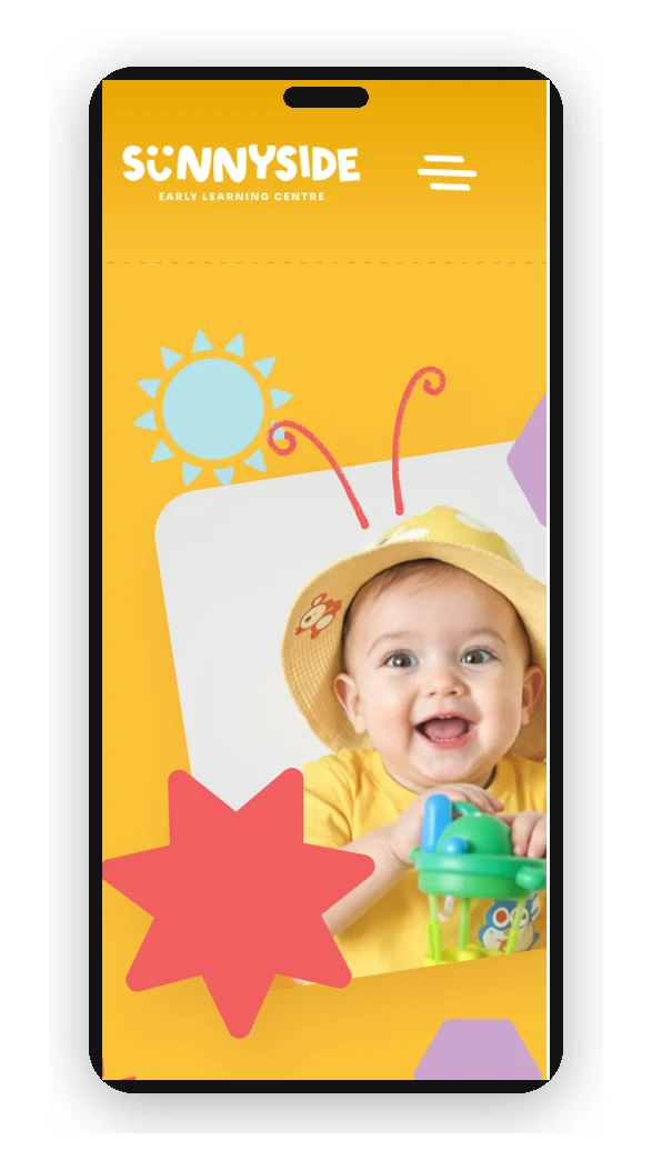
- Built mobile first, because this is an evening, in-bed decision
Bespoke
A drawn kit of parts, reusable forever
The doodles, cut-paper shapes, photo frames and value icons are not decoration dropped into a template. They are a library, built as reusable components in Oncord.
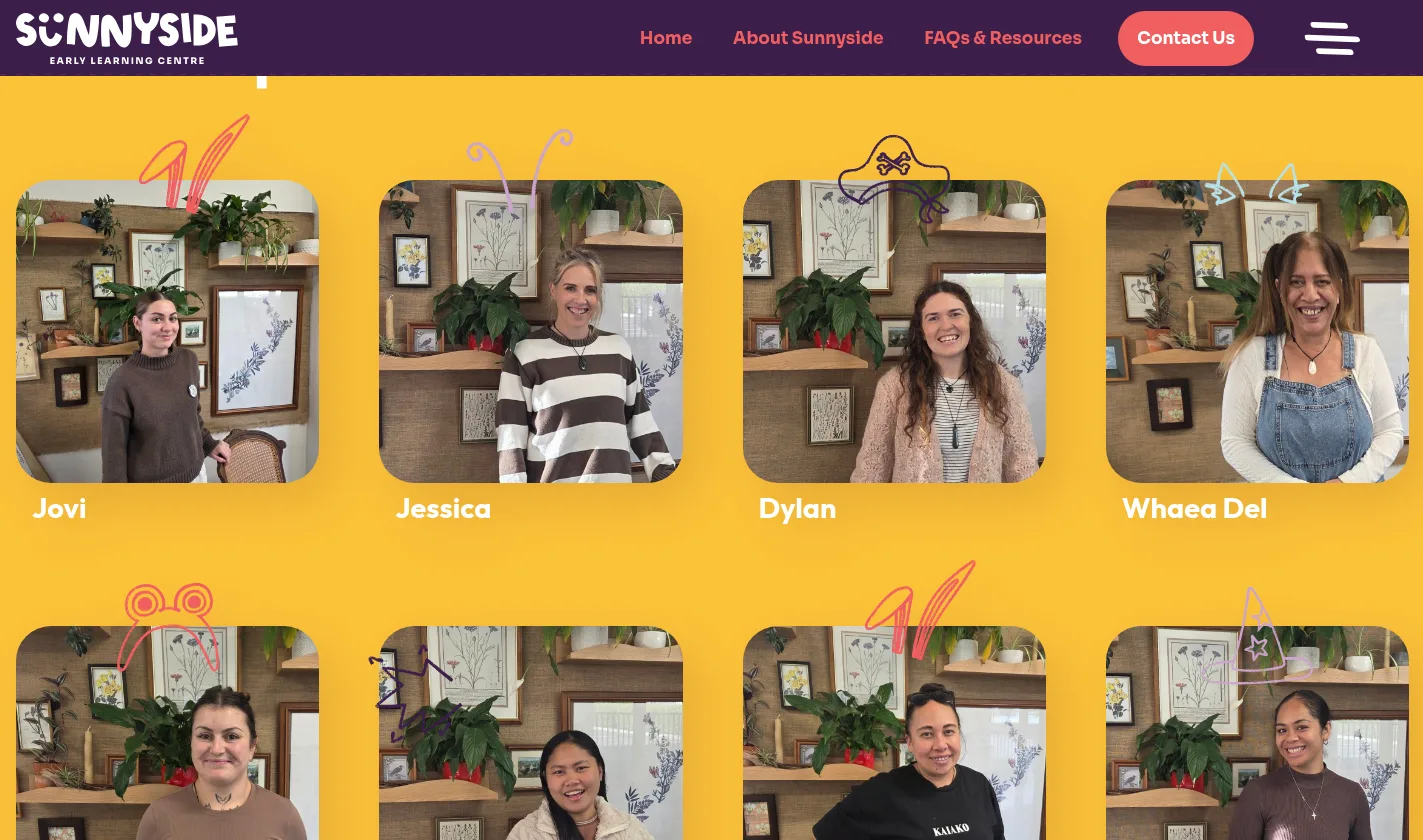
Bunny ears, pirate hats, balloons, suns and antennae sit over staff photos and section corners, pulled from one shared set. Add a new kaiako or a new page and the personality comes with it, without anyone opening a design file.
That is the difference between a playful website and a playful website that still looks right two years later, maintained by the centre rather than by us.
02 — The process
How we got there
- 01
Starting from the parent's evening
We mapped the decision the way it happens: a shortlist on a phone, a scan for fees and hours, then a gut call on whether these are the right people.
- 02
Building the visual language
Sunshine yellow, deep plum and coral, rounded type, hand-drawn doodles and cut-paper shapes, tuned to feel joyful without becoming noisy.
- 03
Writing the content with the centre
Philosophy, values, the bicultural commitment and the FAQ answers, written in Sunnyside's own voice with te reo carried through.
- 04
Animating with restraint
Sections reveal as you scroll and shapes drift gently. Enough movement to feel alive, never enough to get between a parent and the information.
- 05
Handing it over
Staff profiles, gallery posts, news and downloads are all client-editable, so the centre can keep the site current as its team and enrolments change.
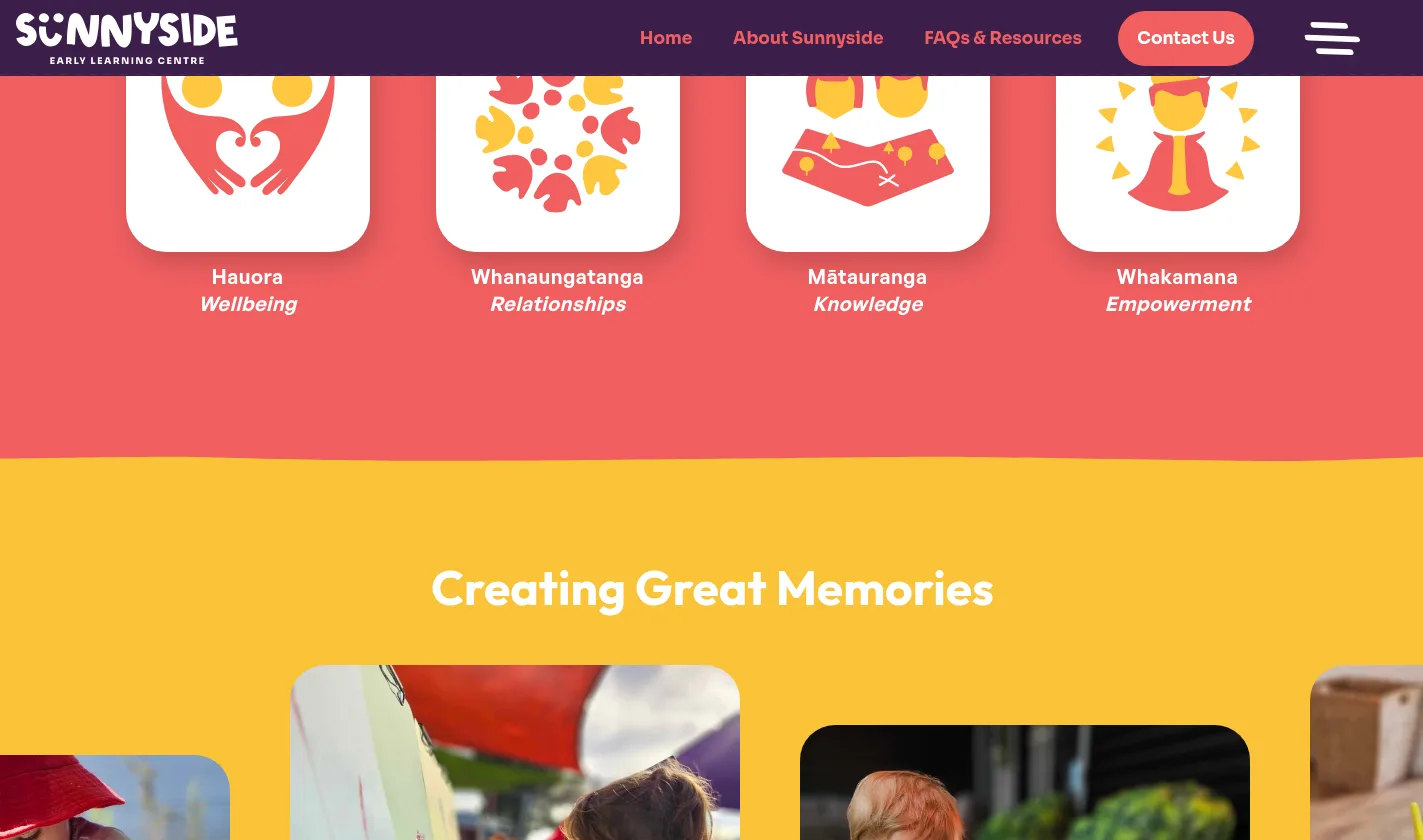
Values you can actually picture Hauora, whanaungatanga, mātauranga and whakamana, each given a drawn icon and a one-word translation, so the centre's philosophy lands in a glance instead of a paragraph.
03 — The outcome
A centre that reads like itself
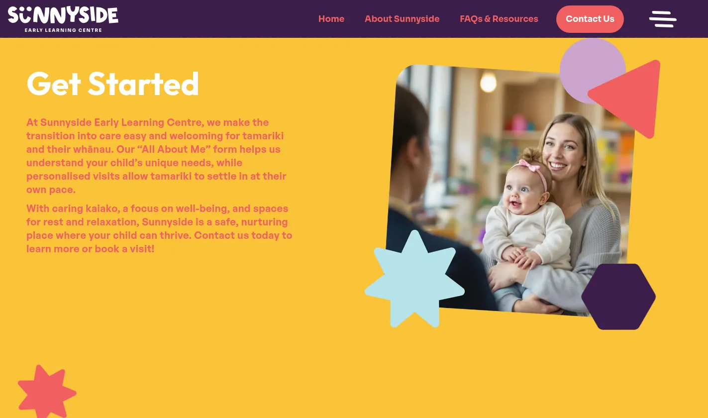
Sunnyside now looks online the way it feels in person, which is the whole job for an early learning centre.
Parents arrive at the enquiry already knowing the fees, the hours, the food and the faces, so the conversation starts further along. The team updates staff, gallery and news themselves.
Small site, tight scope, and a design system that will still be doing its job long after the first intake it was built for.
Ready for a website like this?
Let's build the next one together
Design, build, content and search, handled by one Auckland team.