Introducing responsive website design.
If you haven’t come across the term responsive web design yet, then it’s probably just a matter of time. With the recent explosion of the smartphone and tablet market, websites are increasingly viewed by many different browsers and devices, these sites need to be visible and functional in multiple, dynamic environments. That’s where responsive web design comes in, it’s a bit of a paradigm shift in website design, a new way of developing layouts that can automatically flex and adapt depending on the device.
Web designer Ethan Marcotte, author of ‘Responsive Web Design’ defines the term as;
“A flexible grid with flexible images that incorporates media queries to create a responsive adaptive layout.”
In simple terms, a website designed using responsive design is a bit like a shapeshifter; it will look and behave differently depending on the device.
The idea of responsive web design was inspired by an exciting and futuristic concept called ‘Responsive Architecture’. This is where a tangible space with obvious and immutable constraints and limitations, adapts to cater for the people that occupy it. Walls sense the presence of people and flex in response, glass in meeting rooms automatically turns opaque when certain occupancy levels are reached. Marcotte has successfully applied this concept to website design.
Basically, responsive web design is an evolution of web design and a different approach to building a website. Instead of considering the parameters of the intended device and designing within those constraints, the website is designed to detect the orientation and dimensions of the device and rearrange the layout accordingly. Traditionally, depending on the environment and browser used, the layout and usability could be compromised and even key titles truncated, for example ‘Order Here’ could appear as ‘Ord’. The impact of skewed images and semi obscured titles has the potential to create poor first impressions, frustrate existing users and possibly see the prompt departure of potential customers from your website.
Responsive website design is heralded to create ‘the ultimate in elegant user experiences’. If you consider the example of the following Auckland based company NZ Glass, when this website is viewed on a full screen layout on a 24-inch monitor, the tabs are horizontally arranged across the page. When viewed on a smartphone the tabs are arranged vertically down the left hand side. Different images are selected and arranged in different ways depending on the device. The website ultimately rearranges itself in real time, to optimize the layout and maintain the usability, regardless of the whether you view it on a full screen, smartphone or tablet. A more effective and efficient approach from the not so very old days of building separate sites on subdomains.
For companies investing in new websites it's important to consider the devices that potential customers are likely to use when accessing the site, and discuss the options with your website designer. Part of the discovery process used by experienced website designers, involves analysing the business situation and selecting the appropriate development process to produce the best result for the intended users. For companies that have recently invested in a new website don’t worry, it’s not too late. In certain cases responsive web design techniques can be applied retrospectively, although it would be easier and cheaper to scope the project with responsive development in mind from the outset.
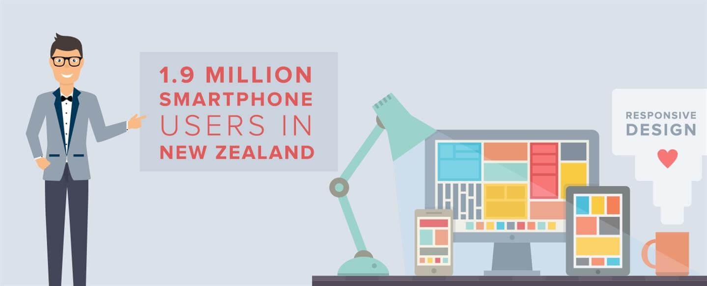
According to the New Zealand Herald there are 1.9 million smartphone users in New Zealand and they spend up to two hours a day using them. It’s not surprising then, that responsive website design is becoming increasingly popular with website designers. The number of devices accessing websites is steadily increasing and showing no signs of slowing down. Mobile browsing is predicted to outpace traditional desktop browsing and in some cases it already has. In that case, new websites designed using responsive techniques will have a distinct advantage in an increasingly competitive market.

