Is your website responsive? Google thinks it should be.

In this modern age, we want our information quickly and without having to zoom in to find what we want…..and Google knows this.
Up to 61% of all search traffic is now coming from mobile devices (in the US according to the Comscore.com Mobile Report as of 14th July 2015) this is having a dramatic effect on how your website is now ranked with Google.
So how is this affecting your online presence?
What this means to all websites from now, is if you're not mobile friendly (i.e. mobile responsive) you will have a significant drop in rankings for mobile search results. However, I do want to make clear (and many web sales consultants are not) that your ‘desktop’ rankings are not directly affected by the new changes.
Phew you might be thinking...
However, there is still going to be an indirect impact on desktop searches, we are finding diminished mobile traffic is also negatively affecting overall desktop search engine rankings. This is because total website traffic is part of Google’s formula when working out your desktop rankings.
As well as this, statistics from Google state there are many next generation users who are becoming ‘mobile only’ they have never owned a desktop computer or not going to replace their existing one, this is a trend we can’t ignore.
What is the difference between ‘mobile accessible’ and ‘mobile friendly’
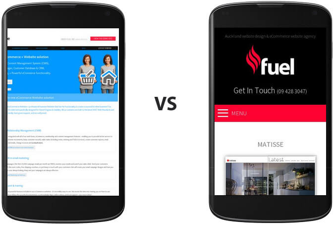
Put simply, mobile accessible websites display the website content on your mobile device, i.e. everything is there, BUT you have to zoom in to see every page clearly. This makes it very difficult to use and filling in simple enquiry forms or purchasing products can be a very tedious task. The results are less people are using your mobile accessible website.
A mobile friendly (or mobile responsive) website will automatically adapt the layout and content to fit nicely into the device you’re reading it on, whether it be tablet, smartphone, laptop or wide screen monitor. Also various parts of the website will be automatically redesigned accordingly, and font or image sizes may be enlarged or decreased and columns may appear and disappear etc.
The end result is the website will be visually more appealing and importantly, more usable. Plus responsive websites are far more adaptable for the future mobile changes that are coming.
Wondering if this applies to you?
It is worth checking your Google Analytics to see what percentage of your traffic is coming from a mobile device. If it’s getting close to
10% or more, many would say you’re already behind the running, and at the rate things are changing you could get left behind quickly.
Check if your website is Mobile Friendly to Google here…
https://www.google.com/webmasters/tools/mobile-friendly/
So in conclusion, If your website is more than 2-3 years old, it may well be time for a ‘refresh’, and we would encourage you to do so soon.
You may not notice the decrease in website traffic or potential business, however your competitors may be winning your potential customers.
Google – God of the Internet – has spoken!
We are more than happy to chat on 0800 fuelme (0800 383563) ext: 216 if you want to know more.

